

 info@cultbooking.com
  0049 30 726225 0
Published on: 01 Mar 2023
Created: 09 Sep 2019 – Updated: 01 Mar 2023
Latest design upgrade on CultBooking was done on December 2018 with a very professional designer specialized on interfaces. This months, July-September 2019, there has been a design upgrade of various parts of the Booking Engine.
Even tough the existing design and functionalities of CultBooking were good, a new designer joined our team and he showed how the existing design could be outstanding with just some small adjustments. I am happy to meet such talented professionals and see end results that prepare our technology for the future, I can say for 2021.
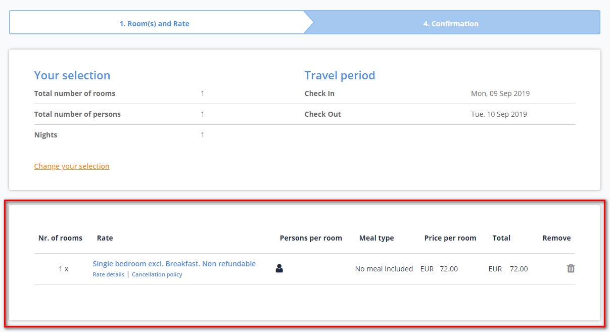
Here are some adjustments made to the booking form, after the user has elected a room, he is on the second page that contains:
Summary
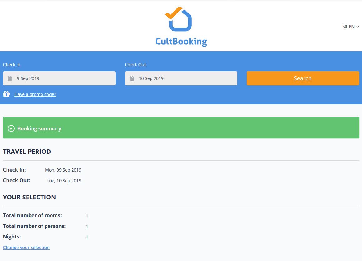
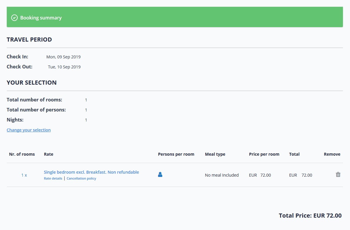
User has selected his room or a combination of various rooms he wants to book. Therefore, he is seing a summary of his selection.
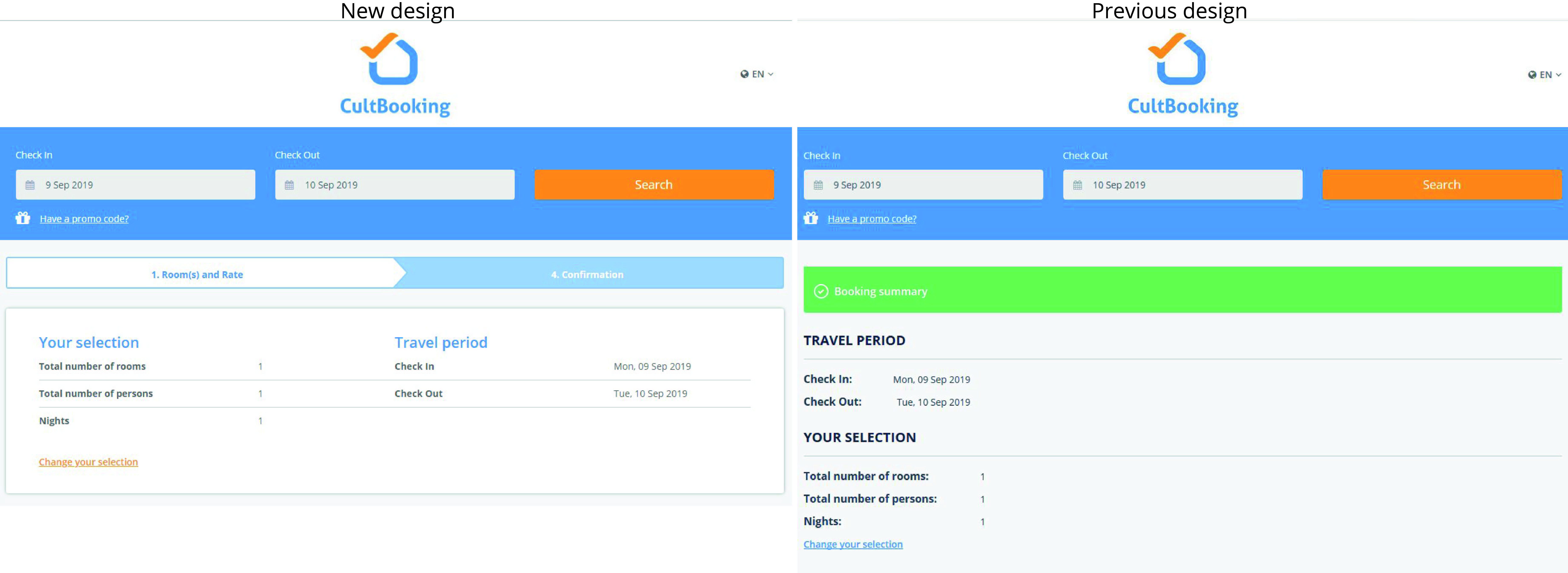
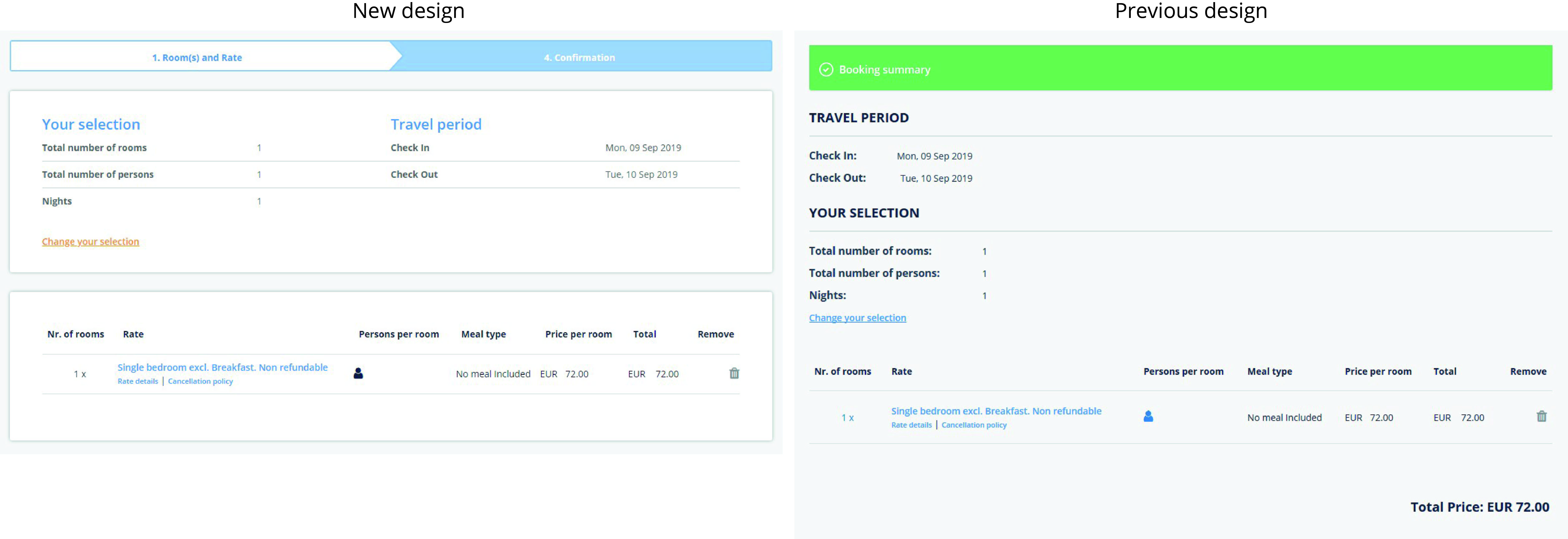
In the new design, ‘Booking Summary’ , the green banner is eliminated and elements are rearranged to make a more compact design. ‘Your selection’ is now the first thing the user sees. This part contains: ‘Total number of rooms’, ‘Total number of persons’ and ‘Nights’.
PREVIOUS DESIGN
NEW DESIGN
‘Travel period’, containing ‘Check In’ and ‘Check Out’ dates selected, is now moved to the right side of the screen. Therefore this part becomes smaller than in previous design.
Capital letters have been removed from words as: ‘YOUR SELECTION’ and ‘TRAVEL PERIOD’. This way design is more unified and keeps same style and structure.
‘Change your selection’ button, is underlined and highlighted in different color, stays the same. Now the button is directly under ‘Your Selection’. Surprisingly to see that many users use this button that has the function to go back to the list of rooms. The search starts from new and no previous data is stored.
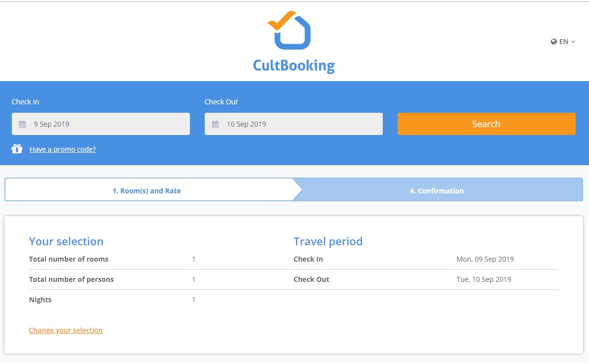
Booking stage bar
A new element and function that has been added is the booking stage bar, showing the steps of the booking process, where the user finds himself. In this case we have 2 stages: ‘1. Room(s) and Rate, this stage also works as a back button. So if user clicks on it, has the same function as ‘Change your selection’.
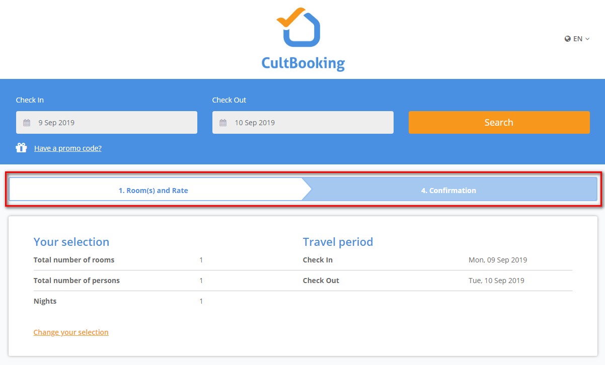
‘2.Confirmation’ is where the user introduces his information to finalize the booking. For the moment we only have 2 or 3 stages, but as the technology advanced, there will be added one more step for extras and add-ons.
Number of rooms
Number of rooms also written as ‘Nr. of rooms’, has now it’s own block. Block separation of the various sections is another point to highlight. This way each section is clearer. Like in the below example:
Here is how was done before in:
PREVIOUS DESIGN
NEW DESIGN
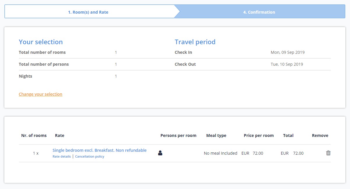
Here is the comparison, side by side of the 2 versions of design. Again, we see a good reduction of the space. Therefore the page is not that long as before. User is still able to find the information fast and in an organized way. There is not too much information packed into one section.
Your details and Guest details
Here is the comparison between new design and previous design for ‘Your Details’ and ‘Guest Details’
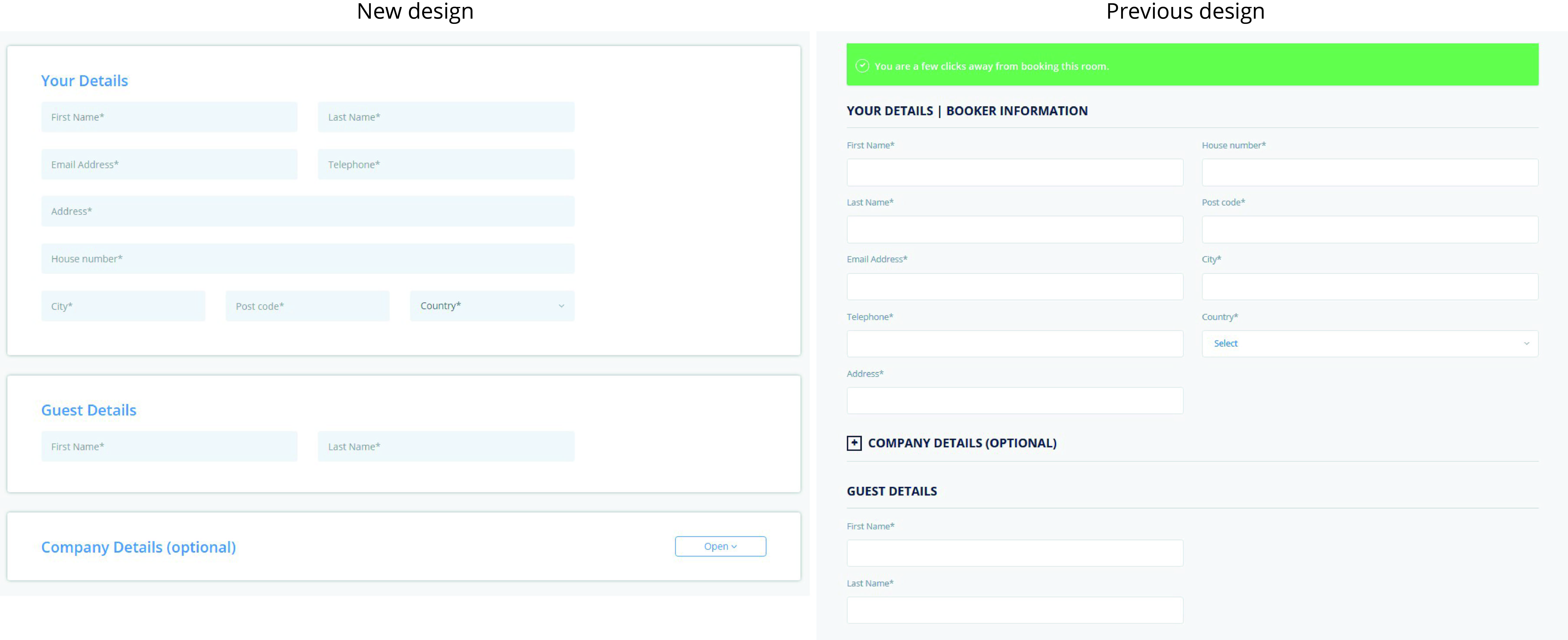
Again the capital letters and heading have been replaced with headings of different color, in this case blue. The call to action banner: ‘You are a few clicks away from booking this room’ has been removed completly, to have a more linear and smooth booking process, with no disturbance.
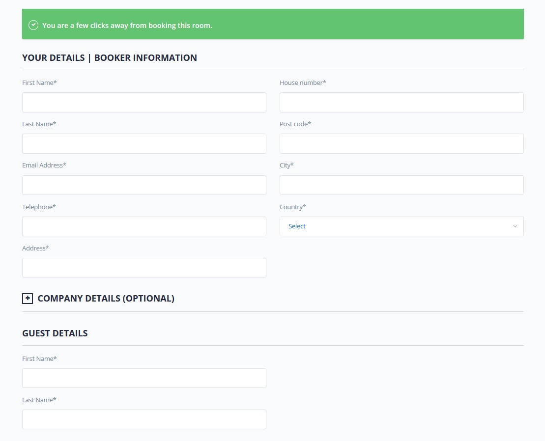
PREVIOUS DESIGN
‘Your Details’ holds the information of the ‘booker’ or person that does the booking on his behalf or for other people, his friends or family. In this section, we see also a new reorganization of the mandatory fields: ‘First Name’ and ‘Last Name’, were written on top of the text box. One field is under the other field.
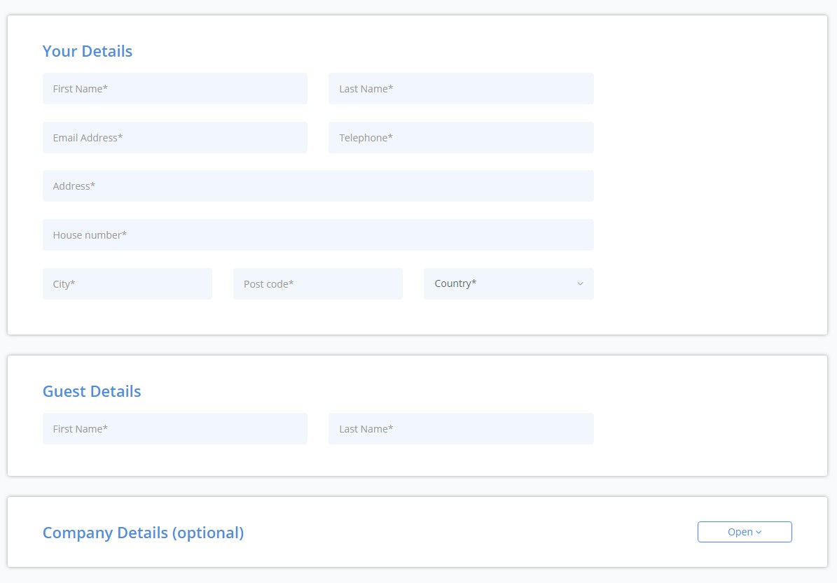
NEW DESIGN
With the new design: ‘First Name’ and ‘Last Name’ are inside the text box, therefore saving space. Also, the fields are one close the the other, one is on the left side and the other on the right side. This makes more sense as we write our names as a sequence, we start with first name and follow with last name or family name. We do not write one name on one row and the other on a second raw. So from logic perspective, we have to congratulate designer again. Well done!
‘Email Address’ follows down below the ‘First Name’. On the right side is ‘Telephone’ number, that is also connected to the mail field as a sequence.
‘Address’ and ‘House number’, here we see first the ‘House number’ field that is for inserting the street. ‘House number’, was inside the ‘Address’ field in design, but developer had to do many changes in logic and therefore is like a long text box. A bit too long for just a 3 digit or maximum 4 digit number.
‘City’, ‘Post code’ and ‘County’ text boxes, are on the same line, one after each other, instead of one under each other.
‘Guest Details’ fields refer to the main guest that books the room or multiple rooms. In most of cases is the same person that makes the booking. That is why these fields are picking the same first and last name of ‘Your Details’. This way, one click is being saved from user perspective. If needed, user can edit these fields with different name.
The improvement on this part is that ‘Guest Details’ follows ‘Your Details’. This section is directly down under and there is no other section in between. In previous design, ‘Company Details’ that is optional field, was in between. So now, the process flow is more logic and has been improved.
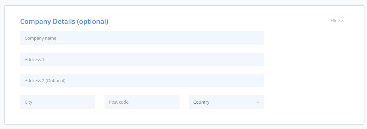
Optional: Company Details and Special Requests
With a fast overview of the two screen shots of optional sections and guest details, it is clearly seen that once more space reduction has been achieved. ‘Guest Details’ names are one after the other and not one down below. So a row of space has been eliminated.
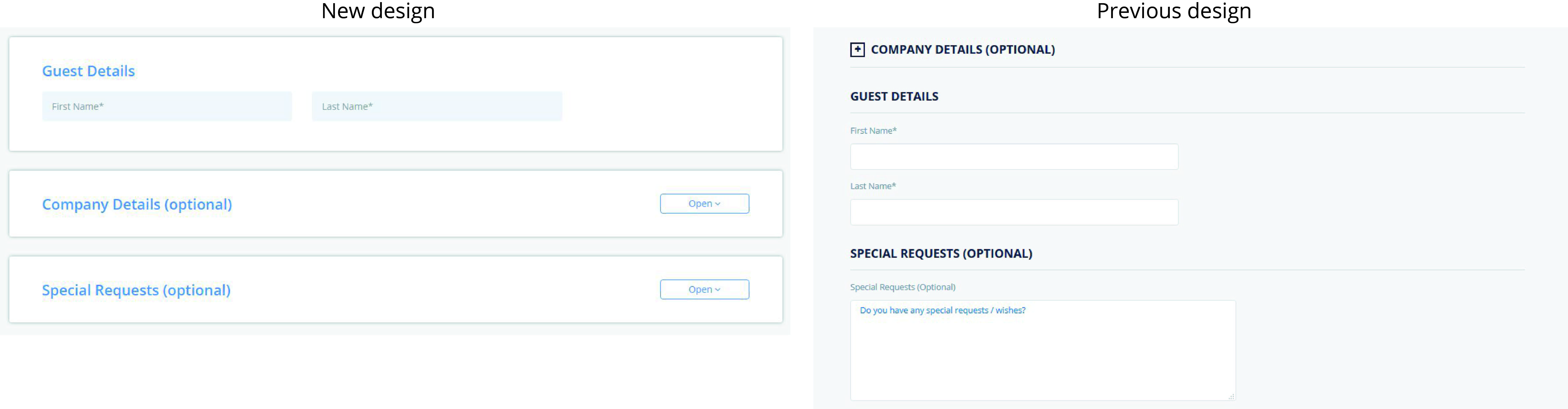
PREVIOUS DESIGN
Previous design has special requests section opened. In most of the cases this text field is not used. So did not make any sense to have it opened all the time. 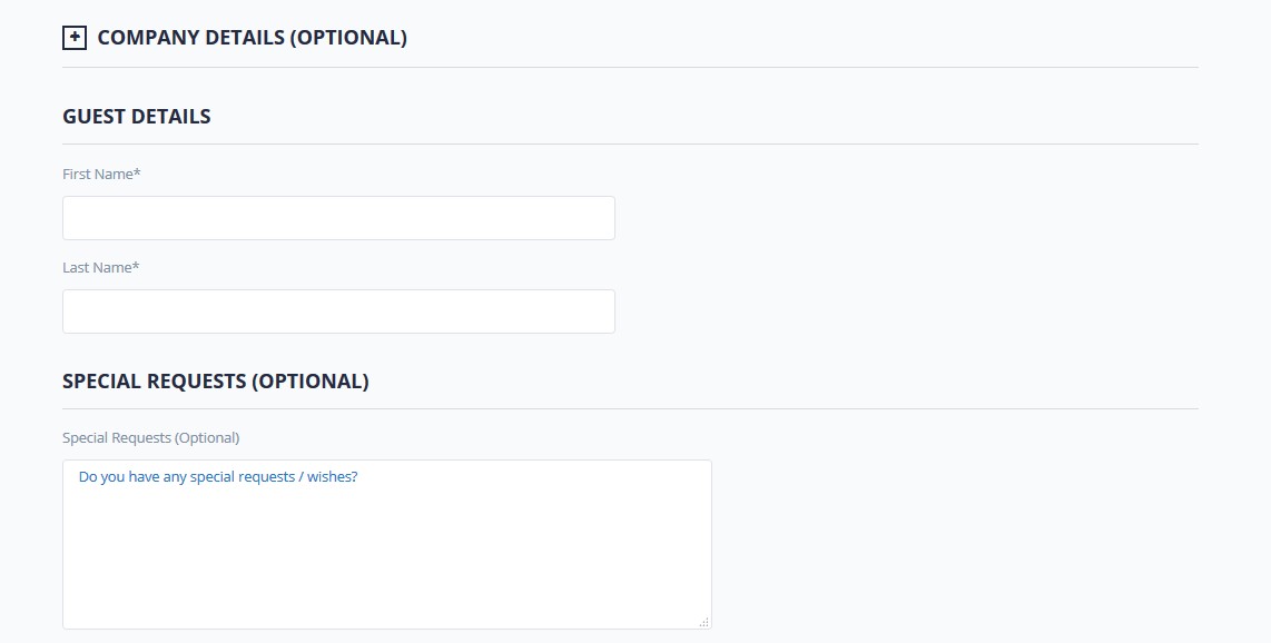
NEW DESIGN
In the new design the optional two sections are one under each other.
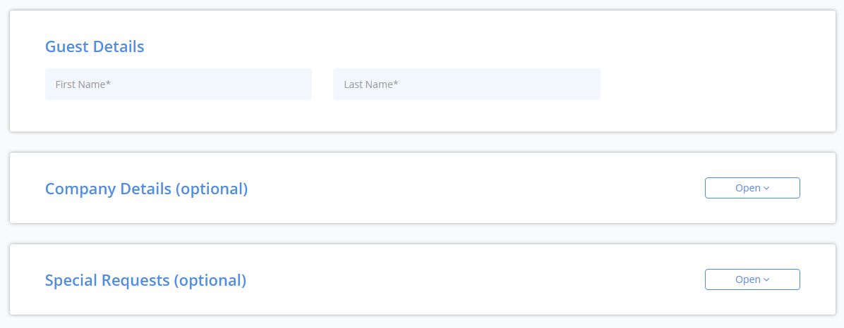
New desgin has ‘Open’ and ‘Hide’ buttons on the right side. Meanwhile the previous design had + – symbol on the left side. Now is clearer the action to be taken by user to open those sections. Below are clear examples: 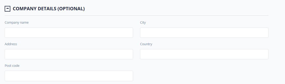
Previous design had total 3 lines of fields. New design has one more line for ‘Address 2 (Optional)’. This field is specific for companies that on Address one insert the adress and on the second one some special indications as ‘Tower B’ or Bloc 2 and so on.
All the changes seem small modifications, but will make a big impact on the conversion rates and the bookings volume, hotels will experiment when the new design is implemented.
Support & Help
For questions and help, you can reach us via the contact form or directly by email: info@cultbooking.com